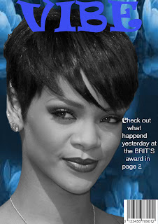
This is the work i made for rhianna 'Vibe' and the most of all reason why theres barley enough writing is because, when i added the blue background colours and headline it made me think, if that can stand out, then whats the point of adding alot of writing so put about the BRITS awards.
Now for this magazine cover i have managed to use at least a couple of different tools than the one i have used on the other two that i have made. The tools are: Magic wand tool/ quick tool, Text tool, Free transform/ Flip horizontal, Importing an image, Duplicate tool and Masking tool. that should mostly be it after everything i have manage to do, to complete this.The Work for this was a bit challenging but its now completed. Also the way i got the background i had to search for the perfect type of picture that will go right. 

Kate
ReplyDeleteThis is a MERIT. you have shown good masking skills and have adjusted the colours, contrast and brightness.
You have added a masthead and one cover line.
To improve this you should add more cover lines, using a range of font sizes to show the different levels of importance of the text.
You should also make sure that your cover lines are aligned with the left and right rulers. Also make sure you don't let the cover lines go over the subject's face
Good work
Mr Monahan